Thursday, March 19, 2009

Re-Cap Project


For mine and Marks 2nd project we created a model/map of information regarding homelessness and its effects on veterans. I liked the subject and wanted to continue on with what we had going on that original piece. As far as information went, I did not collect anymore. We had a healthy amount of it regarding the topic. The 2nd project was a little crazy, so I wanted to go back to what I am more familiar doing. I kept the same info and brought it into illustrator to create a mind map. I wanted the information to be clear and understandable, so I tried to create a hierarchy that flowed smoothly and well. To keep the same information together I grouped sections in opaque colors for easy navigation. I also wanted it to hit home more than just seeing information on a page so I incorporated an image of a homeless veteran, head down with the American flag draped in the background. I bring in a little more element of homelessness I tried to make it look as if the entire piece was mounted on a piece of thrown away cardboard.
What I feel works the best in my piece is the easy navigation, as well as the hierarchy of the alloted information that was collected from the second project. Hopefully it does to others, but I feel like the incorporated images and ideas also make it more real and makes you think more about the problems facing not only homeless veterans, but all homeless. What I feel doesn't work the greatest is perhaps that it may be too much of everything on one poster. It is easy to navigate but, there is also not much breathing room on the page, no white/open space. Luke and I talked about adding colors to it, I am really indifferent about it. I feel that they bring something to the table, but it would be just as effective without them. What we discussed was that hopefully the color would push the design that much further and perhaps add to the design.

Course Reaction

Bruce Mau's readings does not necessarily seem like a way of design thinking to me. It is a compilation of ideas that can be used throughout design.
Here are a few that stood out when I first read it.

Forget about good.
Good is a known quantity. Good is what we all agree on. Growth is not necessarily good. Growth is an exploration of unlit recesses that may or may not yield to our research. As long as you stick to good you'll never have real growth.

Process is more important than outcome.
When the outcome drives the process we will only ever go to where we've already been. If process drives outcome we may not know where we’re going, but we will know we want to be there.

Work the metaphor.
Every object has the capacity to stand for something other than what is apparent. Work on what it stands for.

Don’t be cool.
Cool is conservative fear dressed in black. Free yourself from limits of this sort.

But I believe that all or at least some of these ideas can be applied to all the way of design thinking that we have read about it class and for our blogs. They may seem basic but they can be used as a starting point or as the foundation to your own way of thinking in all kinds of design.
Andrew as a designer still seems to be "behind the curve" compared to what Meredith and Ideo are doing. If Mau's ideas are the basis of design, Andrew still feels strongly in that type of thinking but doesnt hang on to it. He believes that it is progressing something more/different. Davis argues that design is backwards. That the way design is taught is going and has been taught the wrong way, or at least in a less effective way. She believes that line, form, shape, etc should not necessarily be the first thing to be taught regarding design. She wants to us to design and involve ourselves in a challenge that allows us to produce good design and has meaning. This is exactly the type of design that Ideo is aiming towards and accomplishing. They are trying to solve social issues, poverty, economic issues, health, etc. through design. They are trying to contribute to the world and society through design. And myself, this all relates to me because I am a design student. Luke seemed to try and teach or at least attempt to make us understand what each of these designs ideas are and how they relate. Are 2nd project seemed aimed mostly towards what Ideo is doing, but also incorporate the others thinking.

For my own design process, what I followed most was probably Bruce Mau's way of thinking. Forget about good, if you are too worried about the outcome, you are not focused on the process. The process is the most important part of the design, how you came to the decisions that you made, why you made them, etc. Good design comes from thurough process. Work the metaphor. Many things can elude or mean different things to different people. When I design I try to get across what exacty what I mean to. I do not want a design that look/seems like a cohesive mass of ideas. Also, dont afraid to explore and do something different. Just because someone else's design is widely popular, does not mean that it is the only good design. Just be careful when trying new ideas.

5th Reading/reaction

http://www.zeroonezero.com/magic-layers/graphic-design-trends.html
Current Styles in Graphic Web Design, 2006

The 2006 trends in graphic design for web sites are currently taking a turn towards simplicity. Designs are clear, modern, and attractive while being extremely easy to use. Some of the biggest trends are as follows:

Simple layout
It seems that designers are agreeing that simpler is better. Text is laid out more clearly and a return of simple 1-2-3 columns improves the readability of a site and also eliminates the need for your eyes to be skipping all over the page reading text.

Centered orientation
Center-aligning is very prevalent on the Internet. Content centered on the screen appears straightforward and matter-of-fact, creating a sense of balance. In most cases the width is fixed in combination with the center orientation which makes the reading of content more efficient.

3D effects, used sparingly
The use of reflections and shades achieve a 3D feel on icons and branding logos is becoming more popular. A huge reduction in the use of drop shadows can be observed.

Soft, neutral background colors
An increased use of white or grayscale background provides a soft base that allows a designer to draw attention to an icon that flashes, uses strong color, or 3D effects which are other trends in web site graphic design.

Strong color, used sparingly
The soft stylish backgrounds that are so common now-a-days, set the groundwork for the use of strong color that draw attention to important areas on the web page. Whether it is text or icons that pop with color, trends are moving towards bold reds and other deep hues that command attention.

Cute icons, used sparingly
An attractive icon draws attention to company's branding and adds a bit of flair that gets a web site noticed. However, using them infrequently keeps a web site looking professional and avoids cluttering up the page and distracting the user.

Plenty of whitespace
The eye needs enough space around images to allow the brain to see things clearly. Graphic designers are recognizing this fact and allowing for plenty of room around icons and text. The color doesn't have to be white per say but there does need to be a lot of open space.

Nice big text
Good designs show that the most important text on the page is larger than the rest. This obvious trend allows for important details to come across more effectively.

The article I choose to read for my 5th reading is a little excerpt on current design trends regarding recent graphic desing. The article shows design ideas popular in 2006. Some of the trends include simple layout, centered design, 3D effects used sparingly, soft, neutral background colors, strong color and cute icons used sparingly, big text and plenty of white space. I agree with most of these aspects that are briefly discussed. Images need space around them so the mind can comprehend and absorb the image. Not necessarily cute icons, but catchy and trendy icons I agree with. It gives a edge to what is being designed and is different. Bright, bold colors used sparingly is very attention grabbing and I can clearly see how it has been used. I dont really agree with centering the layout. A centered layout can be great but is not always the answer. It is easy to balance that way but you can have a balanced design many different ways.

Monday, March 2, 2009

Reading 4 Reaction

It seems as tho the IDEO foundation would like to try and enrich the world through their use of design. Design working towards solving social issues, including poverty, health, water, economic, environmental and basic services. It makes you realize that design can stretch beyond the realm of just designing posters, handbills, and the like. Design can reach out and contribute to the world to make a difference. This is exactly what our second project was aiming towards. It was just the beginning steps of what can do for us as well as others. They are taking the time to learn. Learn the peoples needs and requests and implementing into design.

The toolkit had three main sections:
Hear - The preperation and gathering of information from farmers.
Create - Analyzing info and data to help create solutions
Deliver - Helping to put the soultions into action.

Project 2 Overview

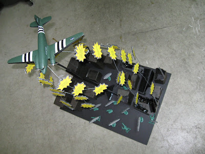
My project, as well as Marks, consisted if gathering knowledge about the homelessness situation concerning veterans. What we originally wanted to do was to layout it out and make a more literal map on illustrator but decided against it. We took the 3-D route instead. What we created was an little model of an airplane dropping "info bombs" over a crowd of homeless veterans announcing their feelings. It was created out of foamcore, cardboards, a model airplane, a dowel, army men, hot glue, tape, wire and paper.

As far as responsibilities in out group, we each held an equal amount. This is because everything that we acquired or worked on we did at the same time, together in the group. This was time use was maximized as well as utilized, costs were split evenly, etc. So neither one of us had the burden of more responsibilities.

What I believe works in out project is the fact that it is so vastly different than any other groups ideas and products. It demands the attention of anyone who sets eyes upon it and kind of draws them in. You want to learn more about what it is and what you can learn from it.
What I believe does not work is the craftsmanship of the project mostly. Although it is not sloppy, it could be done extremely better had the resources and funds been available. The heirarchy can be a little disorienting as well, unless you know what is going on it can seem unorganized.

Monday, February 2, 2009

Blauvelt Reaction

First a couple quotes from the reading I like/enjoyed.

"Design, because of its functional intentions, has always had a relational dimension. In other words, all forms of design produce effects, some small, some large. But what is different about this phase of design is the primary role that has been given to areas that once seemed beyond the purview of design’s form and content equation."
"Once shunned or reluctantly tolerated, constraints — financial, aesthetic, social, or otherwise — are frequently embraced not as limits to personal expression or professional freedom, but rather as opportunities to guide the development of designs; arbitrary variables in the equation that can alter the course of a design’s development. Seen as a good thing, such restrictions inject outside influence into an otherwise idealized process and, for some, a certain element of unpredictability and even randomness alters the course of events."

I feel quite a bit the same about this reading as I do about our first. It was hard to follow and hard to pull things out of it. The two quotes above are what stood out to me the most. Quotes I can realte to and believe in. His links to history in modern design and todays design were very clear. But what I feel he is talking about the most is how design is progressing into the future, what direction it is taking from where it had started. It is hard to tell where the design field is headed though because ways and practices are always changing, there are different ways to learn and progress.

This link contains several ideas of learning and progressing through graphic design:
http://noisydecentgraphics.typepad.com/design/2006/06/the_future_of_g_1.html

What is interactive desing?
http://en.wikipedia.org/wiki/Interactive_design